How to Simulate Color Blindness for Accessible Design
Simulate color blindness to see your designs through the eyes of users with protanopia, deuteranopia, tritanopia, and achromatopsia. Learn how the three cone types in the human retina — L, M, and S — create color perception, and why 8% of men have red-green color vision deficiency. Apply WCAG 1.4.1 (Use of Color) success criterion and avoid the most common UX anti-pattern: conveying information through color alone without redundant text or icon indicators.
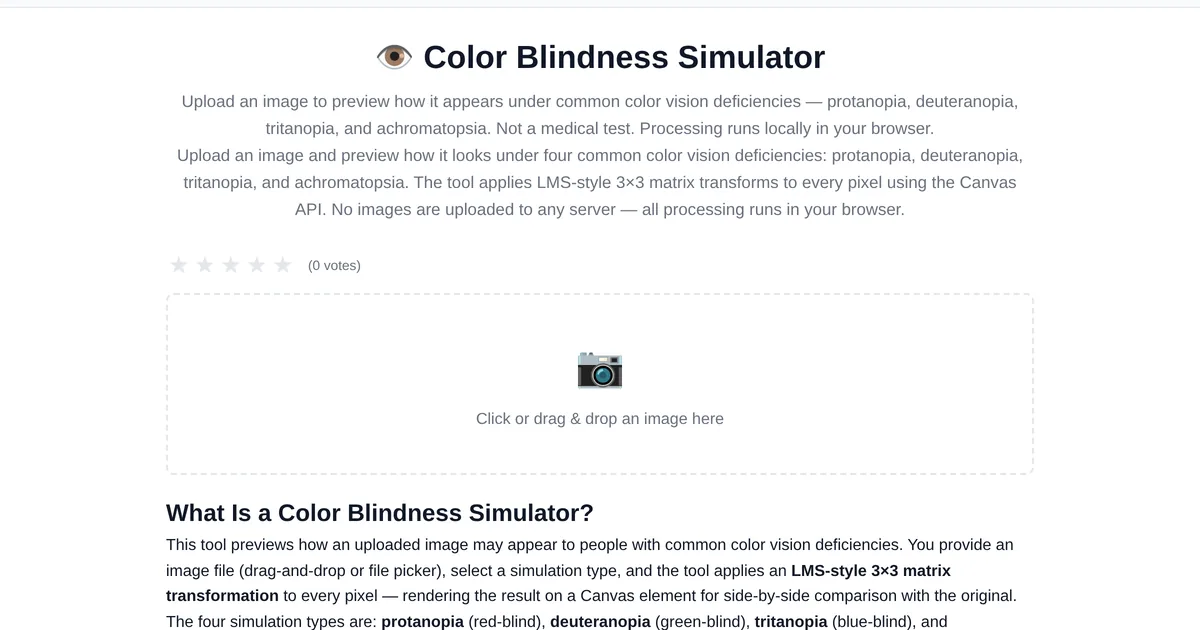
About 8 percent of men and 0.5 percent of women have some form of color vision deficiency. If your design relies on color alone to convey information — red for errors, green for success — a significant portion of your users will miss the message. A color blindness simulator shows you exactly what they see.
The four types of color blindness
The ToolStand Color Blindness Simulator uses Canvas LMS color space matrices to simulate: Protanopia — red-blind, most common. Reds appear dark or muted. Deuteranopia — green-blind, also common. Greens become brownish. Tritanopia — blue-blind, rare. Blues become greenish. Achromatopsia — complete color blindness, very rare. Everything appears in grayscale.
How to use the simulator
Upload a screenshot of your design, website, or app. Toggle between the four simulation types. Look for: elements that become indistinguishable (red and green buttons look identical under protanopia), information conveyed only by color (a chart where the legend is impossible to match), and insufficient contrast (text that fades into the background).
The biology of color vision — how your cones actually work
Human color vision relies on three types of cone cells in the retina: L-cones (sensitive to long wavelengths, red), M-cones (medium, green), and S-cones (short, blue). Each cone contains a photopigment that responds to a specific range of wavelengths. Color blindness occurs when one or more cone types are missing or shifted. Protanopia (1% of men): L-cones are missing — red appears dark, and red-green discrimination is impossible. Deuteranopia (6% of men): M-cones are missing — the most common form; red and green look similar. Tritanopia (<0.01%): S-cones are missing — blue-yellow confusion. Achromatopsia (rare): no cone function at all — only rod-based grayscale vision. Understanding the biology helps you design for the actual sensory experience, not just pass an accessibility checklist.
WCAG 1.4.1 — Use of Color and why it is the most violated guideline
WCAG Success Criterion 1.4.1 (Level A) states: "Color is not used as the only visual means of conveying information, indicating an action, prompting a response, or distinguishing a visual element." This means: error states cannot be red-only — add an icon or text label. Required fields cannot be red asterisk-only — add "(required)" text. Charts cannot use color-only legends — add patterns, labels, or direct annotation. Links within body text cannot be color-only — underline them. This is a Level A criterion, meaning it is the most basic level of accessibility every site must meet. The Color Blindness Simulator helps you audit your designs against this criterion by showing exactly what users with each deficiency see.
UX writing anti-patterns — when your words break for color-blind users
Interface copy that references color is the silent accessibility killer. "Click the green button" — a deuteranope user cannot distinguish green from red. Instead: "Click Continue." "Fields marked in red are required" — a protanope user sees red as dark gray. Instead: "Required fields are marked with an asterisk (*)." "The status indicator turns green when ready" — use both color and text: "Status: Ready." "See the blue section below" — reference position or heading text, not color. These fixes cost nothing to implement but make the difference between a usable interface and one that silently excludes 8% of male users. Audit your UI copy alongside your color palette — both must pass the simulator test.
Beyond simulation — design patterns that work for everyone
Simulation is a diagnostic tool. Actual accessible design requires systemic patterns: 1. Redundant coding — every color-coded element gets a shape, icon, pattern, or text label. 2. High contrast — use a contrast checker to verify 4.5:1 minimum. 3. Color-blind-friendly palettes — blue-orange, blue-yellow combinations are distinguishable by all common CVD types. Avoid red-green and green-brown pairings. 4. Focus indicators — keyboard users need visible focus rings; these also help low-vision users. 5. Grayscale-first workflow — design in grayscale first, then add color as enhancement. If it works without color, it works for everyone. The Color Blindness Simulator fits into step 2: validate your palette at every design review.
Fixing color accessibility issues
Add icons or patterns. A red error state should also show an X icon. A green success state should show a checkmark. Use sufficient contrast. WCAG 2.1 requires at least 4.5:1 contrast ratio for normal text. Label directly. Instead of "click the green button," label the button with text like "Submit" or "Confirm." Test with grayscale first. If your design works in achromatopsia mode, it works for all color vision types.
Explore the full collection of free tools at toolstand.io. Free, forever. No sign-up. No download. Just tools that work.
Frequently Asked Questions
How do I test my design for color blindness without uploading anything?
The Color Blindness Simulator runs entirely in your browser — upload an image, paste a URL, or use the color picker to sample specific colors. No files leave your device. Switch between protanopia, deuteranopia, tritanopia, and achromatopsia modes to audit every state of your interface. For real-time testing, use the simulator alongside your design tool to catch issues before they reach production.
Is color blindness simulation accurate?
Simulators use color transformation matrices based on the LMS (long-medium-short) cone response model. They shift colors into the perceivable gamut of each deficiency type. The results are approximations — no simulation can perfectly replicate another person's sensory experience — but they are accurate enough for design auditing. The gold standard is testing with actual color-blind users, but the simulator catches the most common issues: insufficient contrast between red-green error/success states and color-dependent data visualizations.
Can color-blind people see any color at all?
Yes. Color blindness is almost never total color blindness (achromatopsia is extremely rare). The vast majority of color-blind people see a reduced range of colors — they struggle to distinguish specific color pairs (red-green, blue-yellow) but can see most colors normally. A deuteranope sees the world in blues, yellows, and grays, with reds and greens appearing as muddy browns. The simulation tool shows approximations of what each type perceives.
What percentage of users are color-blind?
Approximately 8% of men (1 in 12) and 0.5% of women (1 in 200) have some form of color vision deficiency. Red-green deficiencies (protanopia, deuteranopia) account for 99% of cases. For a website with 10,000 daily visitors, roughly 400-425 users experience colors differently than you designed them. This is not an edge case — it is a statistically significant user segment.
Does dark mode help color-blind users?
Dark mode does not fix color vision deficiency, but it can help by increasing the luminance contrast between elements. However, saturated colors on dark backgrounds can still be indistinguishable. A red error badge on a dark background looks dark gray to a protanope — the same problem as in light mode. The design pattern (redundant coding with icons + text) matters more than the color scheme. Test both light and dark modes with the simulator.